CityPups
Bridging the Information Gap in Online Dog Adoption
Modified GV design sprint case study
Context
This project was completed as part of a modified GV design sprint. CityPups is a fictional company aiming to improve the online pet adoption experience for people living in urban environments. Unlike traditional shelters, CityPups aggregates adoptable dogs from multiple sources and helps users find dogs that fit their unique living situations and routines.
The Problem
Most adoption websites present dogs with minimal context about how they might fit into an adopter's lifestyle, especially for people living in cities. Key lifestyle factors such as being okay alone during the workday or handling city noise are rarely addressed. This leaves adopters feeling unsure, frustrated, and hesitant to move forward.
The Solution
CityPups aims to help users feel confident and supported throughout the adoption journey. The design includes a match making flow that identifies suitable dogs. When a dog’s profile is missing key compatibility information, the app auto-generates a message that users can send to the shelter to get their questions answered.
My Role
As the sole designer on this project, I was provided with research findings to define the core problem, map the adoption journey, and explore potential design solutions. I developed a prototype focusing on the most critical user interactions and conducted usability testing to assess whether users noticed and valued the added support features.
I reviewed the challenge brief, competitive landscape, and findings from early interviews. Many urban adopters reported frustration with vague dog profiles. They worried about size, temperament, training needs, and whether a dog could adapt to their lifestyle (e.g. small apartments, 9–5 workdays, busy streets. They also noted that it was difficult to find the right contact information for shelters and that repeatedly stating what they were looking for felt tedious. From this, I created a user map that tracked the adoption journey from opening the site to reaching out to a shelter.
Day 1 - Understand and Map
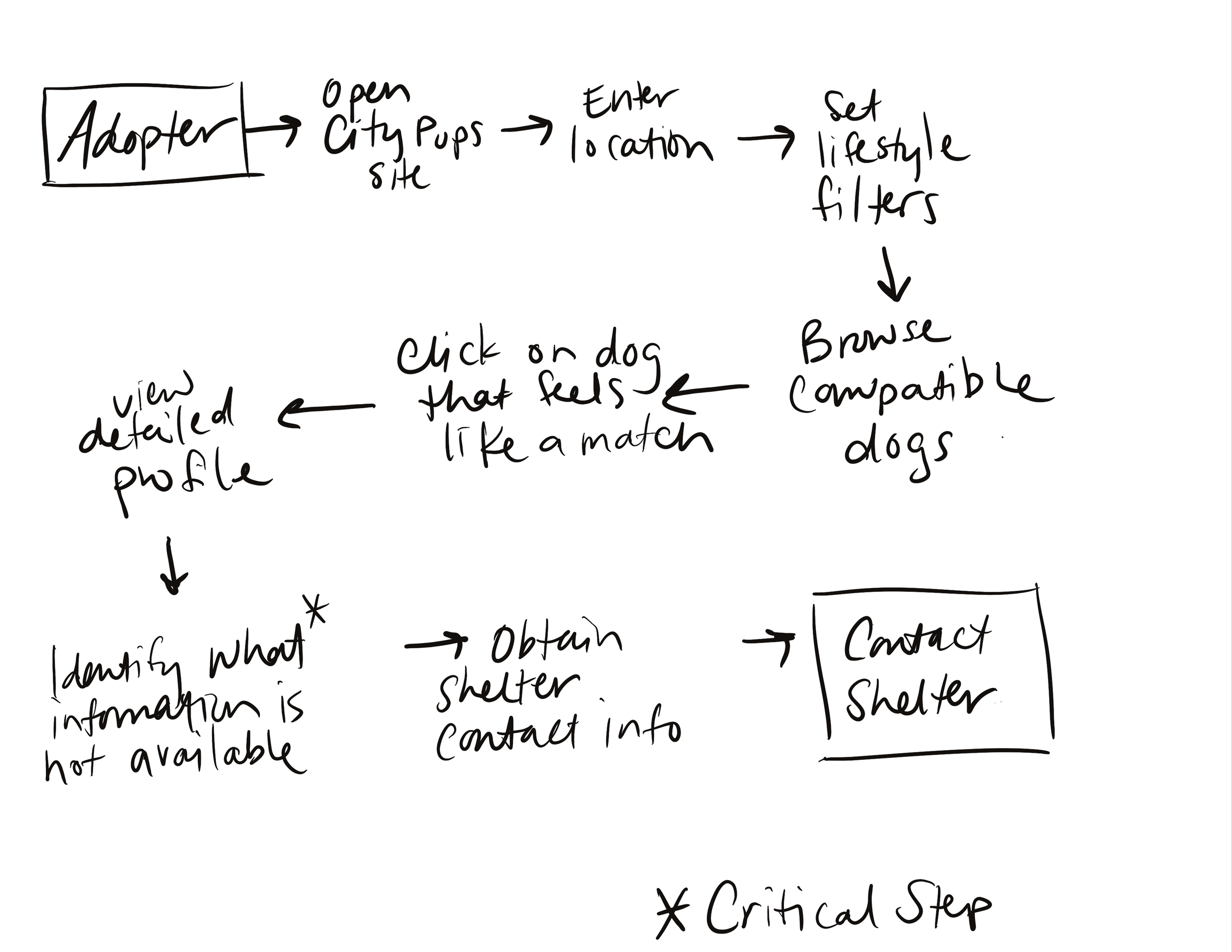
User Map
Day 2 - Inspiration and Ideation
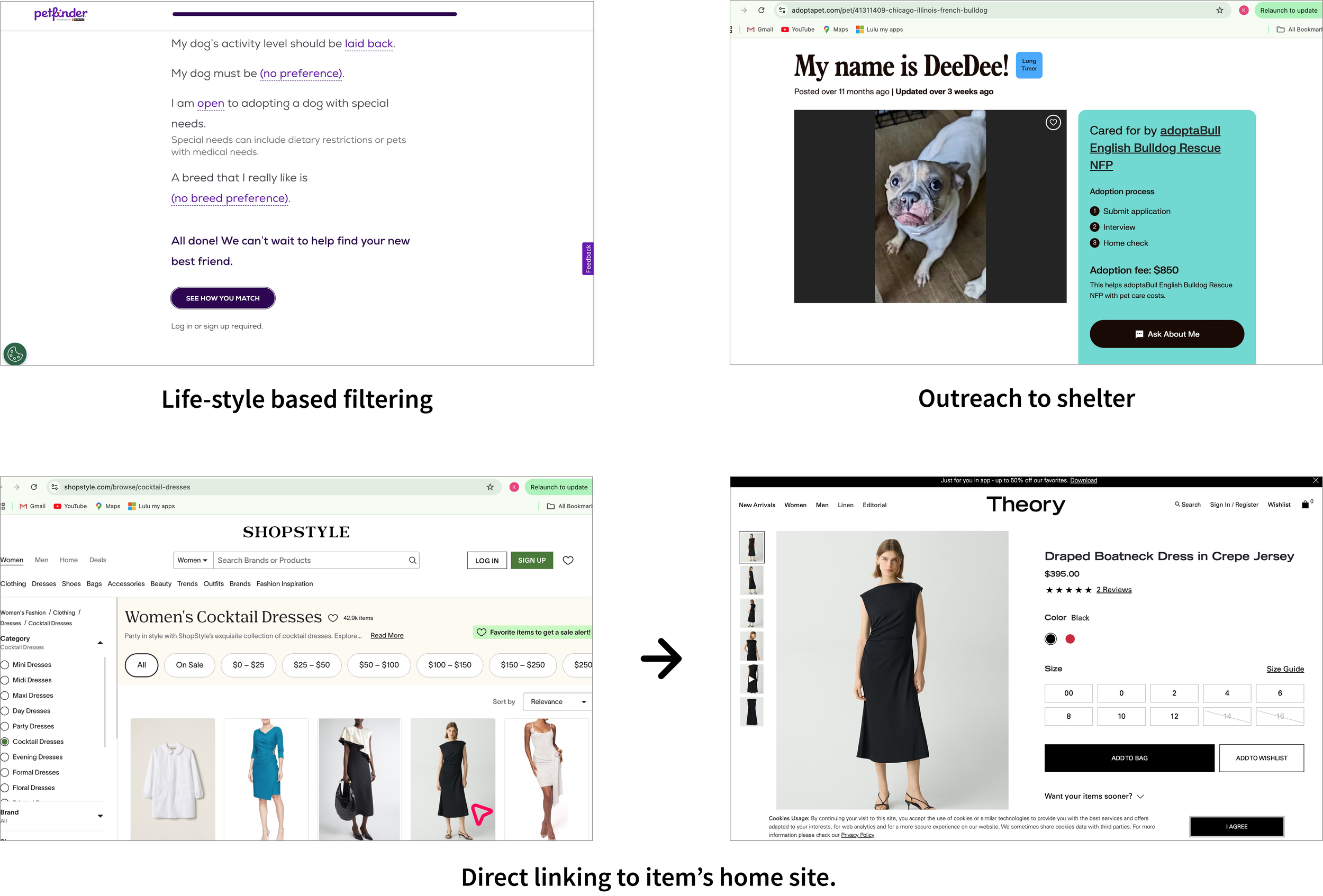
I began Day 2 by reviewing comparable experiences through lightning demos. From pet adoption platforms like Adoptapet.com and Petfinder.com, I noted features like lifestyle-based filtering, in-profile match assessments and the ability to send inquiries to shelters. I also drew inspiration from Shopstyle.com’s browsing flow, filtering flexibility and direct linking to the item’s home website.
Lightning Demos
From the user flow I mapped on Day 1, I identified the most critical screen as the moment when a user views a dog’s profile and realizes key compatibility information is missing. Since CityPups doesn’t control the data provided by shelters, I saw an opportunity to support users not by adding more filters, but by helping them recognize what isn’t there and guiding them toward a next step. I generated Crazy 8s sketches exploring ways to flag missing details and offer support.
Crazy 8s
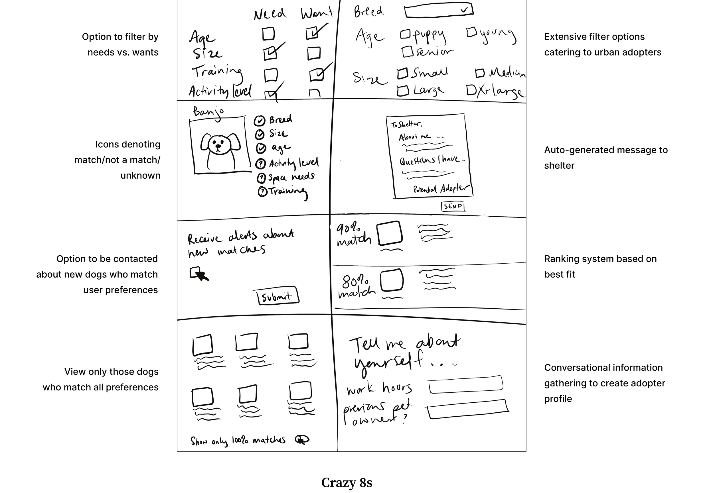
Crazy 8s
My final 3-panel solution sketch mapped a flow where users enter their preferences, view their matches with missing information clearly highlighted, and are prompted to contact the shelter using a pre-written message tailored to their concerns. This screen was designed to transform a frustrating moment of uncertainty into a supported action.
Solution Sketch
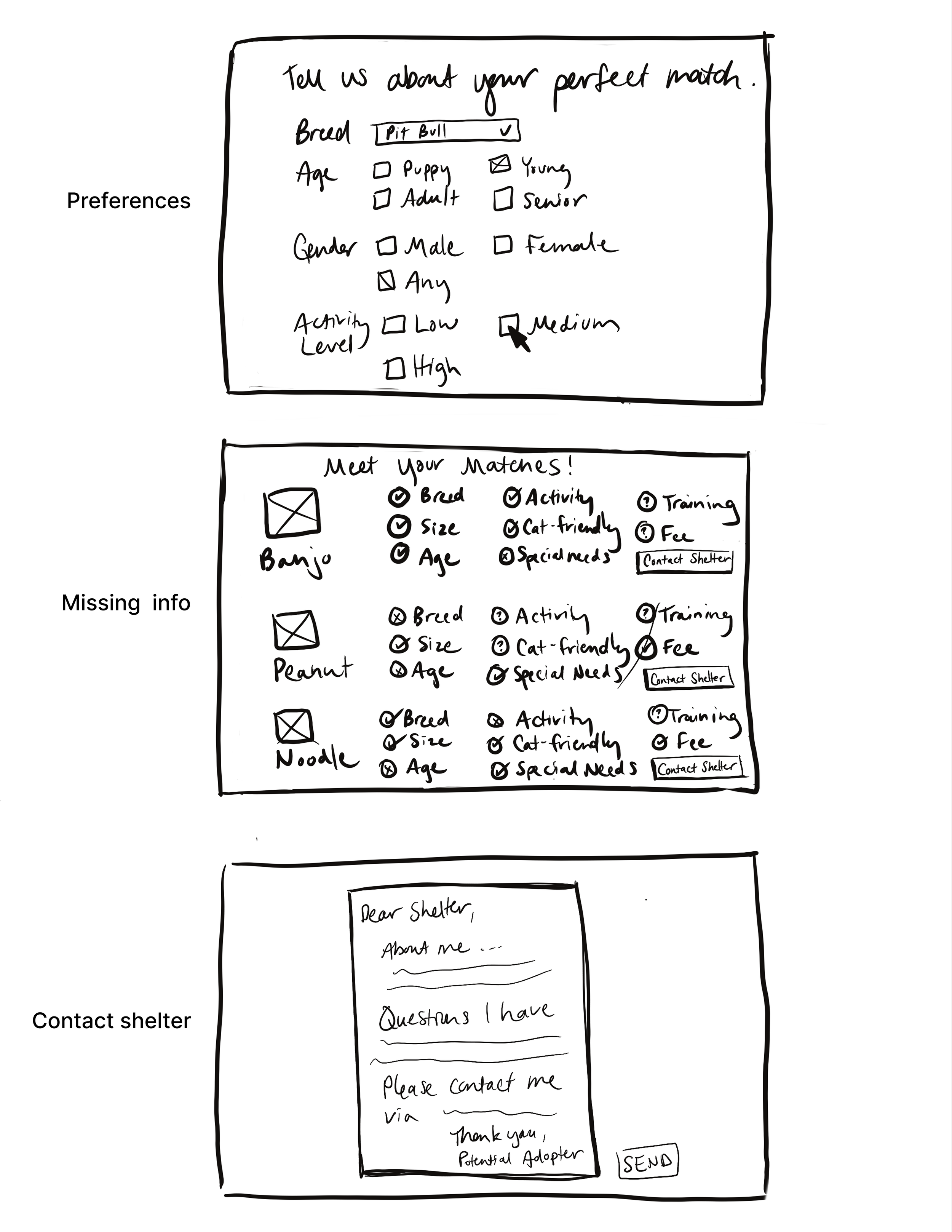
Solution Sketch
Day 3 - Storyboard
I created an 8-frame storyboard showing the flow from Google search through to sending a message to the shelter. The flow included setting preferences, browsing matches, viewing a dog’s profile, identifying missing info, and seeing a pre-written message with a clear CTA. This helped me finalize the flow and tone for the prototype.

Storyboard
Day 4 - Prototype
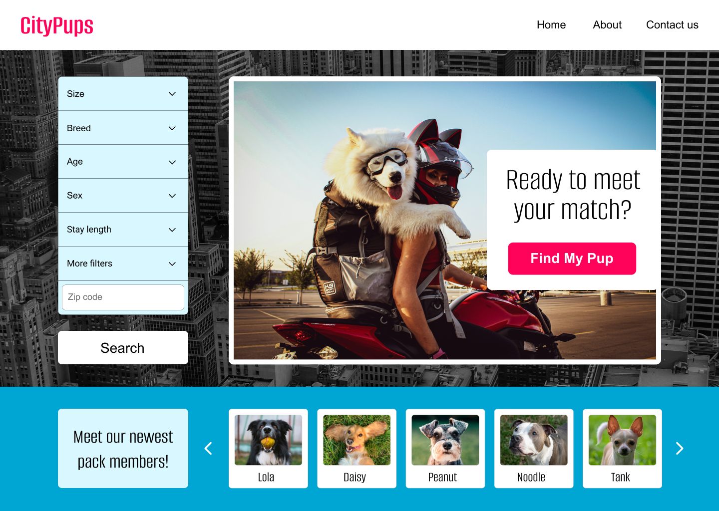
The prototype was designed to resemble a standard pet adoption website to test whether users would notice and engage with added features. The match results screen displays multiple dogs, and each profile intentionally leaves out certain compatibility details to reflect real-world information gaps. Unlike other platforms that require users to click a button to generate a message to the shelter, the auto-generated message in this prototype appears directly on the dog’s profile page, based on the user’s previously entered preferences. I decided on this placement to reduce friction and help users easily take the next step.

Match Screen
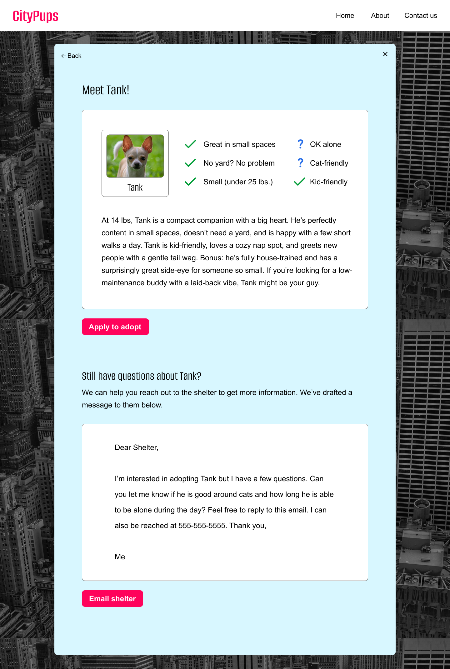
Profile screen with auto-generated message
Day 5 - Testing
Users
I conducted five remote user testing interviews with individuals who were either actively considering adopting a dog or had adopted within the past two years. All participants live in Chicago, which allowed me to focus on feedback from urban users navigating the specific challenges of city-based pet adoption. Their recent and relevant experience made their input especially valuable to the goals of the project.
Process
Interviewing and testing remotely gave me the opportunity to observe how participants naturally interacted with the prototype in a more relaxed setting. I used a think-aloud protocol to better understand their reasoning as they moved through the experience, which helped surface both intuitive interactions and moments of hesitation.
Goals
The goals of testing were to evaluate whether users noticed and engaged with the features intended to highlight missing compatibility information, whether the icons clearly communicated what was missing, and whether users found the auto-generated message to the shelter helpful.
Insights
Across the five sessions, users consistently recognized the missing info icons and were able to explain what they meant. Several participants expressed relief that the system acknowledged what wasn’t known, and most said the auto-drafted message would make them more likely to reach out. Some noted that they might not have thought to ask those questions without the prompt, which reinforced the value of surfacing user-specific gaps.
Overall, testing showed that users felt more confident and supported by the feature set, and that the prototype helped bridge a common information gap in online adoption journeys.
Reflections & Next Steps
This sprint highlighted how even small additions, like an auto-filled message, can have a big impact on user confidence. In future iterations, I’d like to test this flow with people who are in the adoption process to assess how well it supports real decision-making. I’d also explore how shelter response times affect trust in the system and consider building in a tracking feature for follow-ups. Overall, this project deepened my understanding of how to balance emotional needs and decision support in high-stakes digital experiences.
Let’s Connect
Thanks for taking the time to check out this case study. If you're curious to hear more about my design process, want to share feedback, or just want to connect with a fellow designer, I’d love to hear from you.

More Projects