Premium, Not Pushy: Crafting Upgrade Moments That Users Welcome

VibeFlow is fictional media company with a strong base of free users ready to monetize through a Premium tier.

Create upgrade paths for new and returning users that feel seamless and speak to tech-savvy, budget-conscious users.
- UX Researcher
- UI Designer
- UX Designer
Many freemium products rely on pushy upgrade tactics that can erode user trust, especially with younger users. At the same time, subtle or poorly timed prompts may go unnoticed.
Design an upgrade offer experience that feels:
What makes streaming users willing to pay for a premium experience?
When in the user journey are they most open to upgrading?
What causes hesitation, resistance, or mistrust around upgrading?
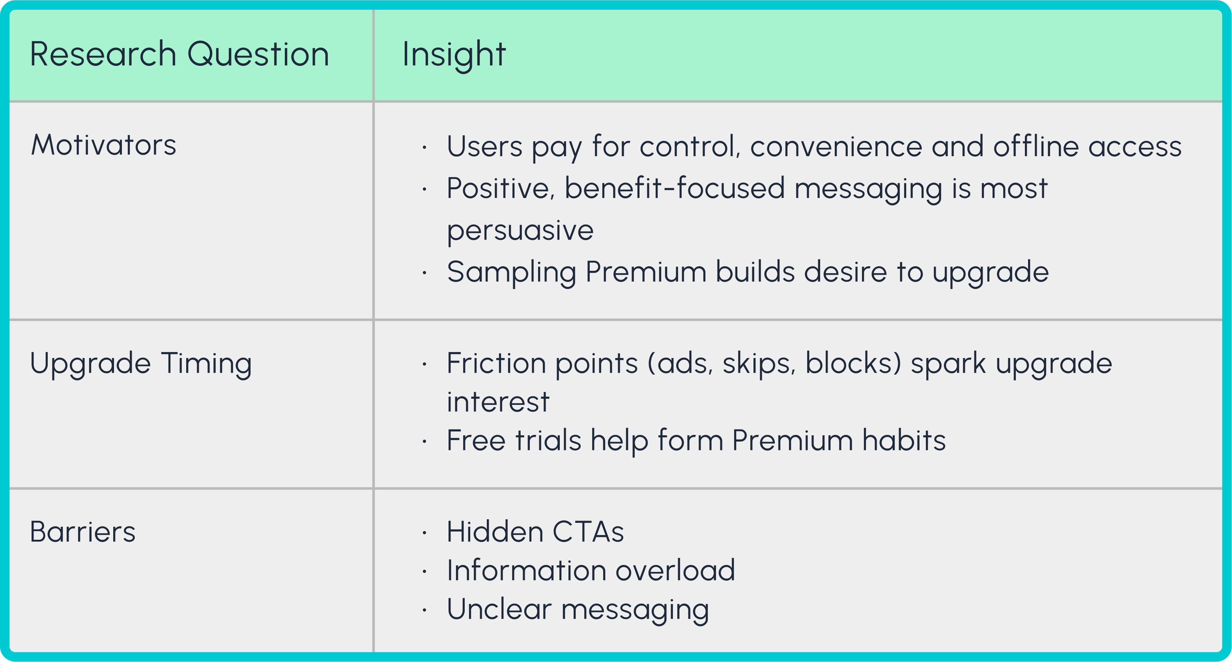


Upgrade prompts should appear during moments of natural user desire or friction, not random
Messaging should be positive, benefit-driven, and clear about premium value
The upgrade flow should be fast, low-friction, and transparent about pricing and terms
Offer users small tastes of Premium features, like free trials, to build desire without high pressure
Guided by the business goals, I designed two categories of flows:
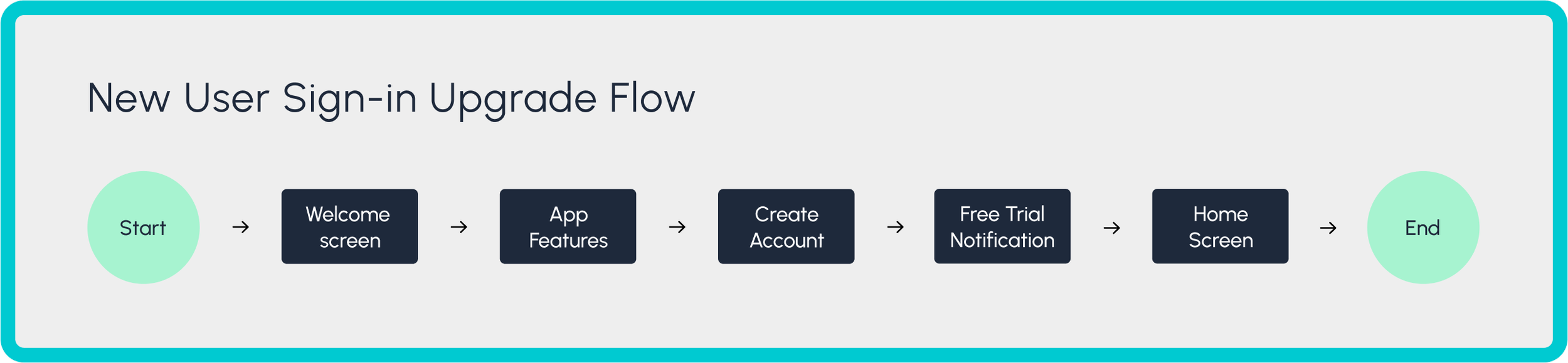
1. Sign-in flows for new and returning users
2. In-app flows triggered by user actions like skipping, downloading or creating playlists
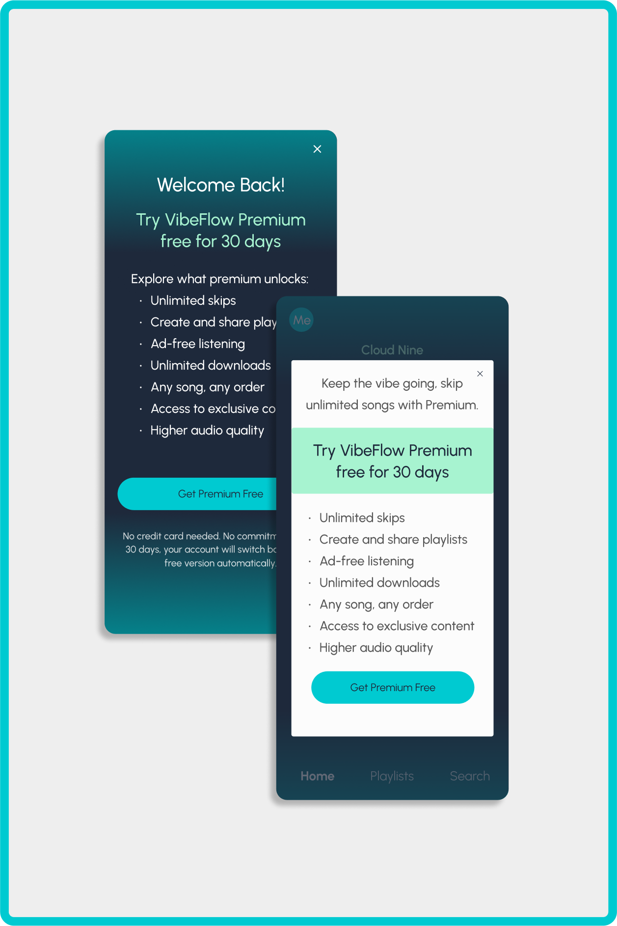
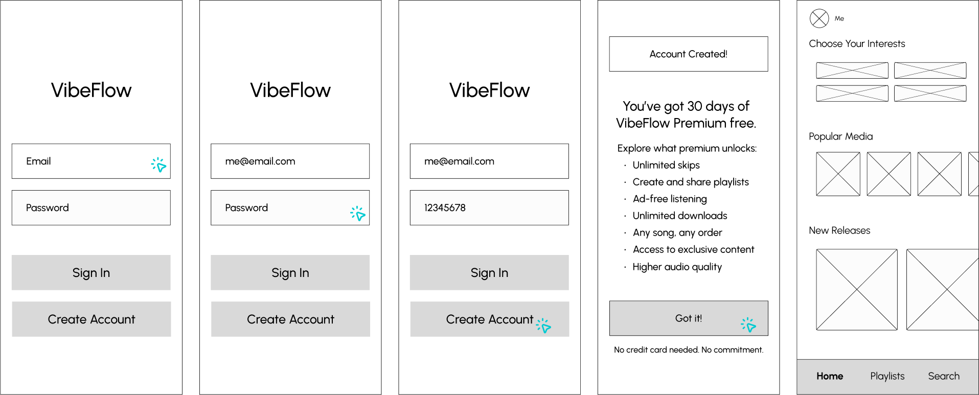
New users are automatically enrolled in a free Premium trial during sign-up. This removes friction and helps establish early habits around premium features.
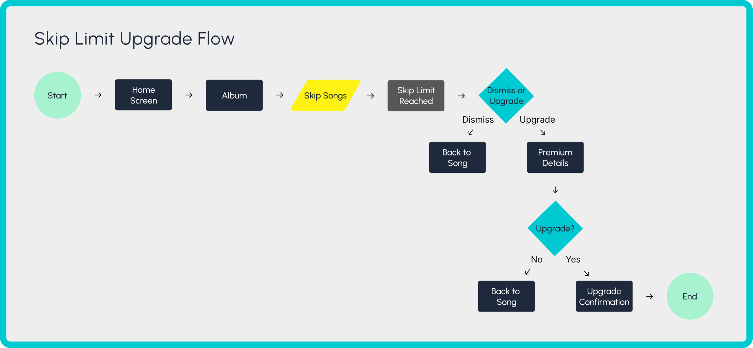
This flow places the upgrade prompt directly after a blocked action, aligning the offer with user intent and maintaining continuity in the listening experience.
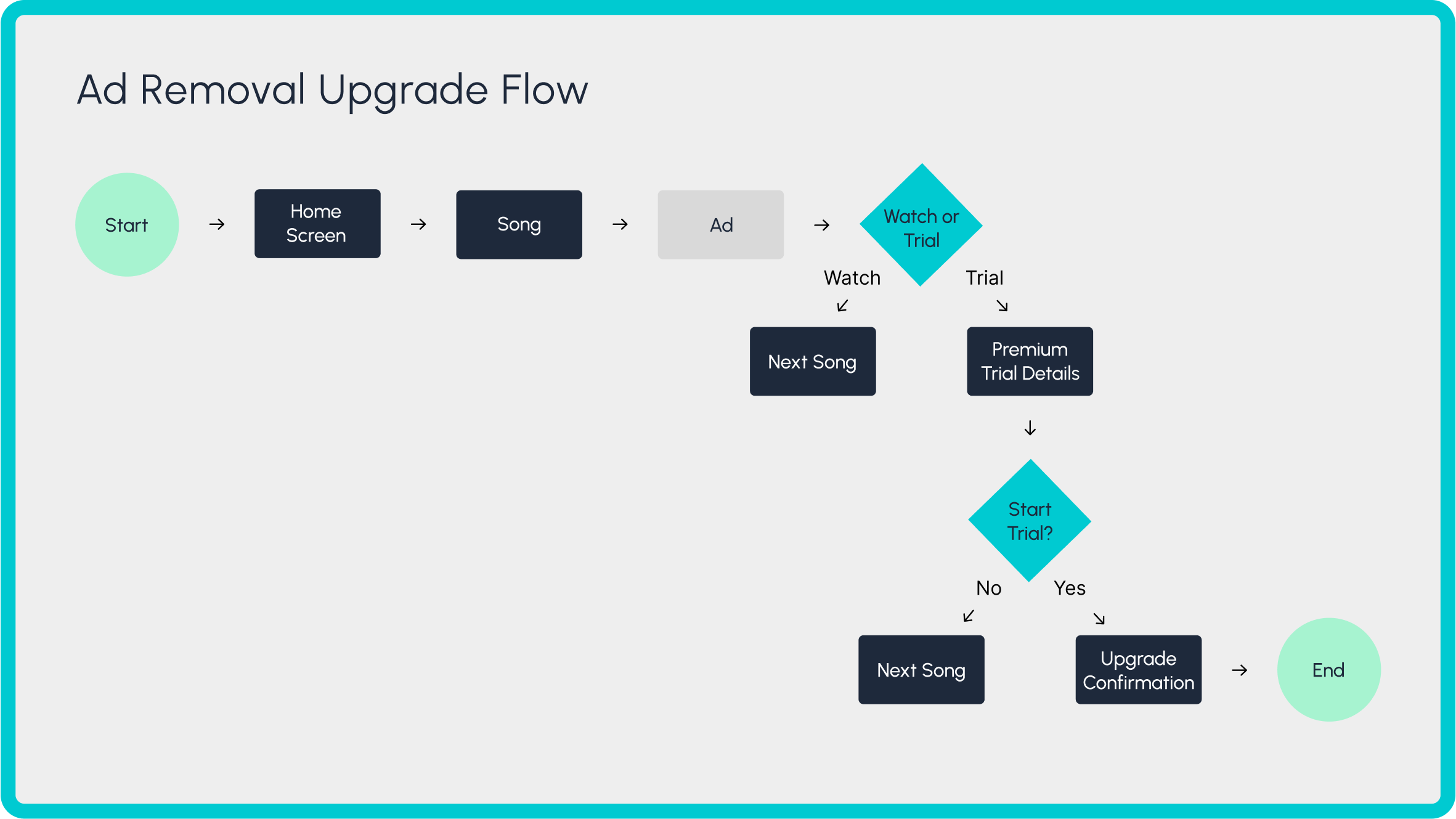
The upgrade prompt is shown during an ad, leveraging user frustration as a natural point of interest in Premium.
Additional flows (e.g., playlist creation, download attempt, profile upgrades) followed a similar structure, surfacing upgrade prompts at moments that highlight the value of the Premium experience.
After mapping out key upgrade moments in the user journey, I translated those flows into wireframes to test the placement, tone, and clarity of upgrade messaging.
Skip Limit Prompt
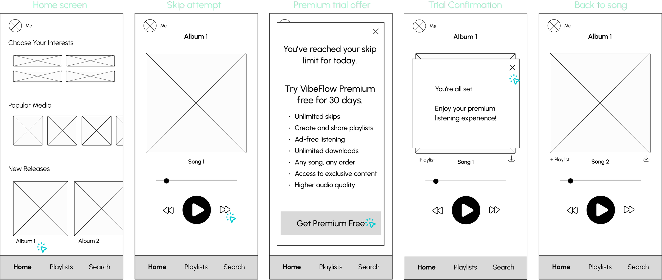
The upgrade screen was designed to offer a clear call to action alongside a supportive message and a dismiss option to preserve user autonomy.
Ad Removal Prompt

A banner invites users to explore Premium. Once tapped, it opens an upgrade screen that highlights Premium benefits along with a clear call to action.
After completing the low-fidelity designs, I realized the upgrade prompts felt repetitive and could be easily dismissed. This led me to explore auto-enrolling users in a 30-day Premium trial to reduce friction and encourage deeper exploration of premium features. As a result, I shifted my original testing plan and decided to conduct a preference-based usability test comparing opt-in versus auto-enroll trial flows.
Auto-enroll
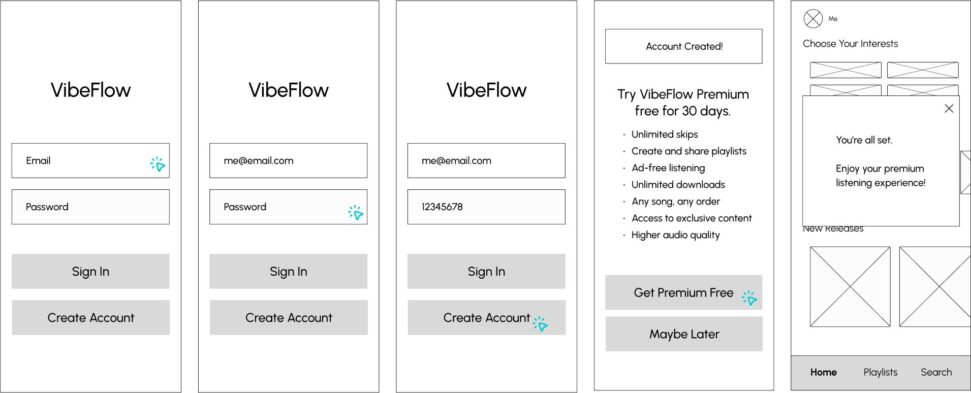
Opt-in

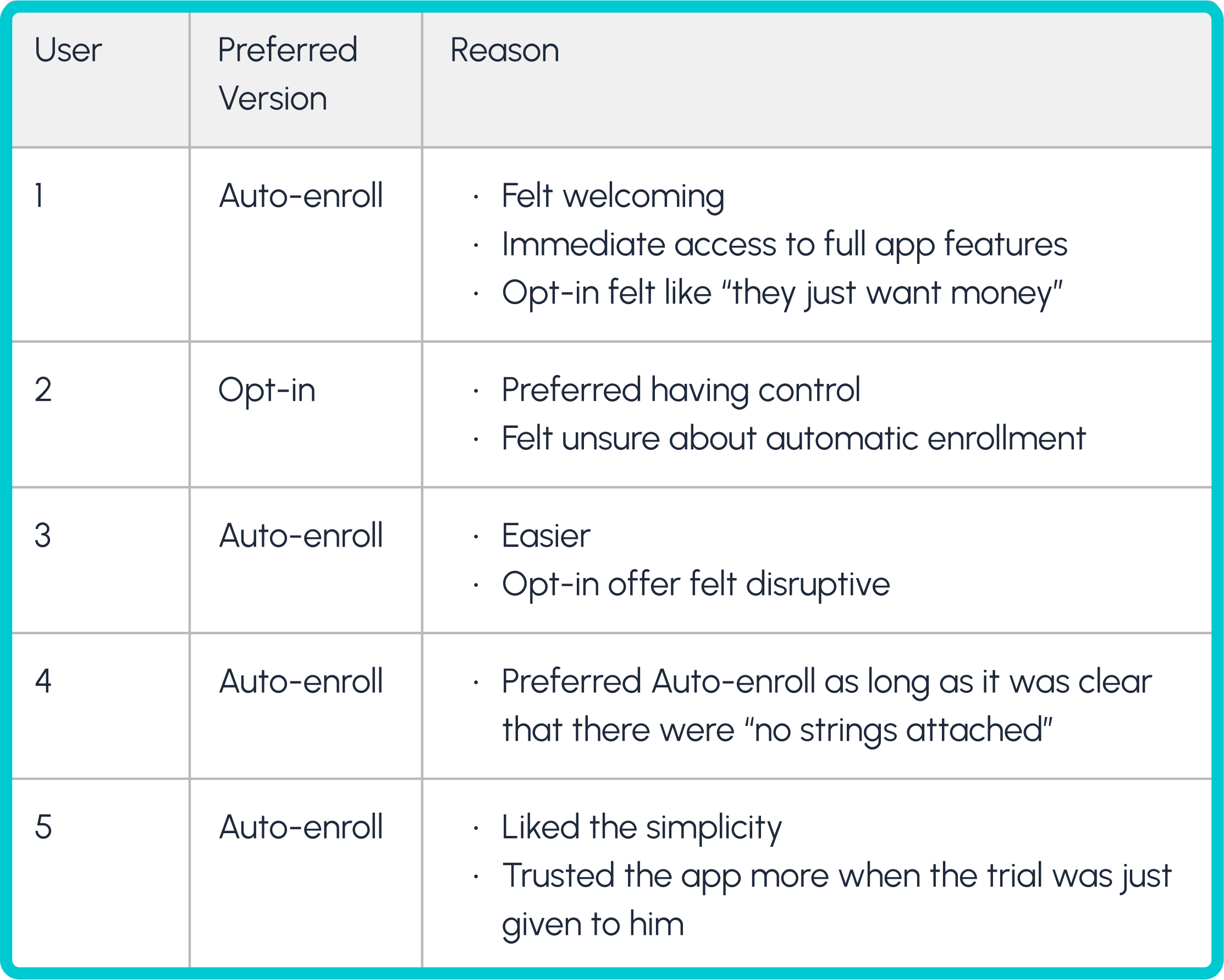
To explore how best to introduce a free Premium trial, I tested two onboarding flows: one that automatically enrolls users, and one that asks them to opt in.
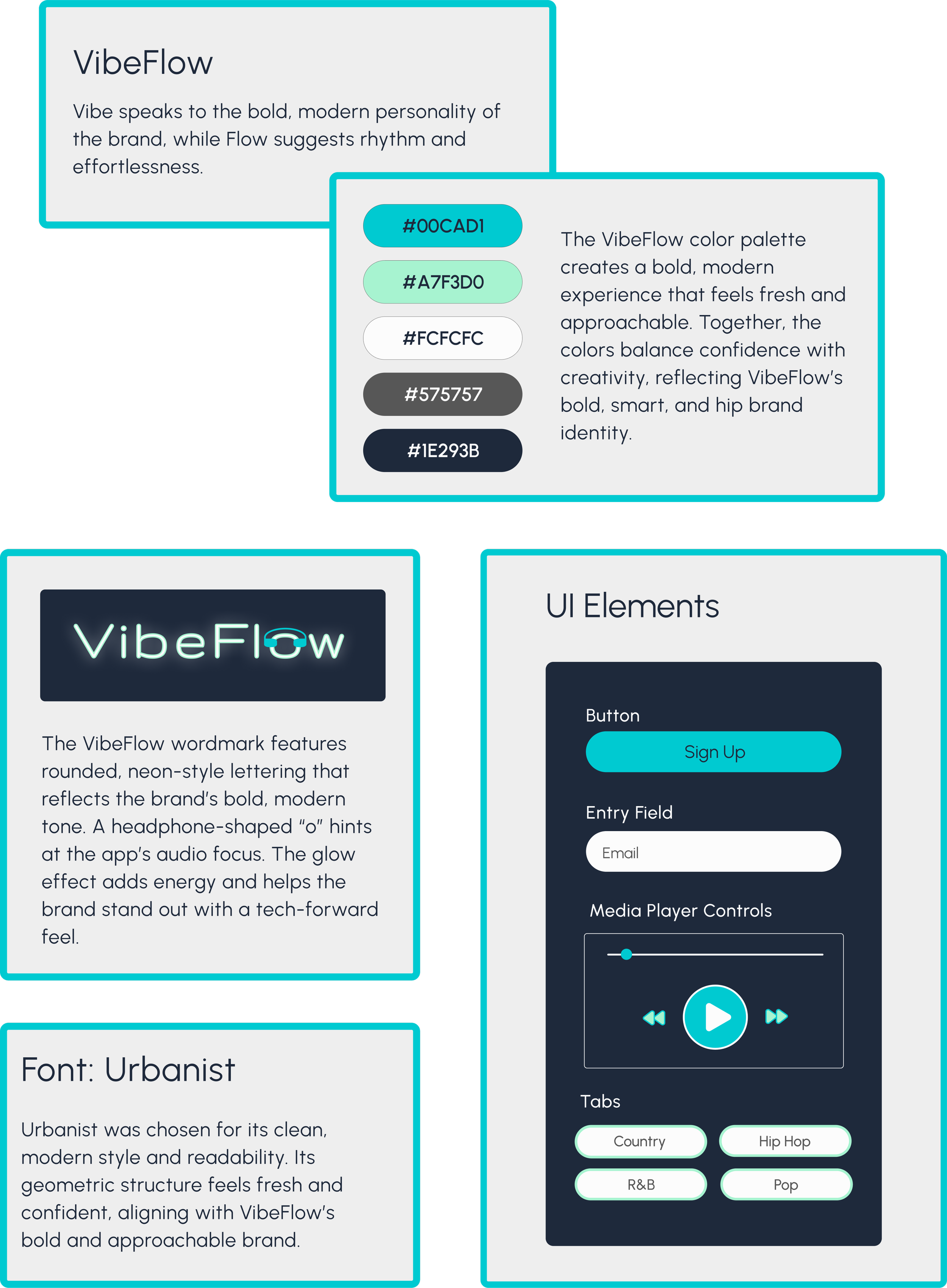
With a clearer understanding of user preferences around trial enrollment, I turned to defining the app’s visual style. The company aimed to project a personality that felt uniquely diverse yet familiar. Bold, smart, and hip.

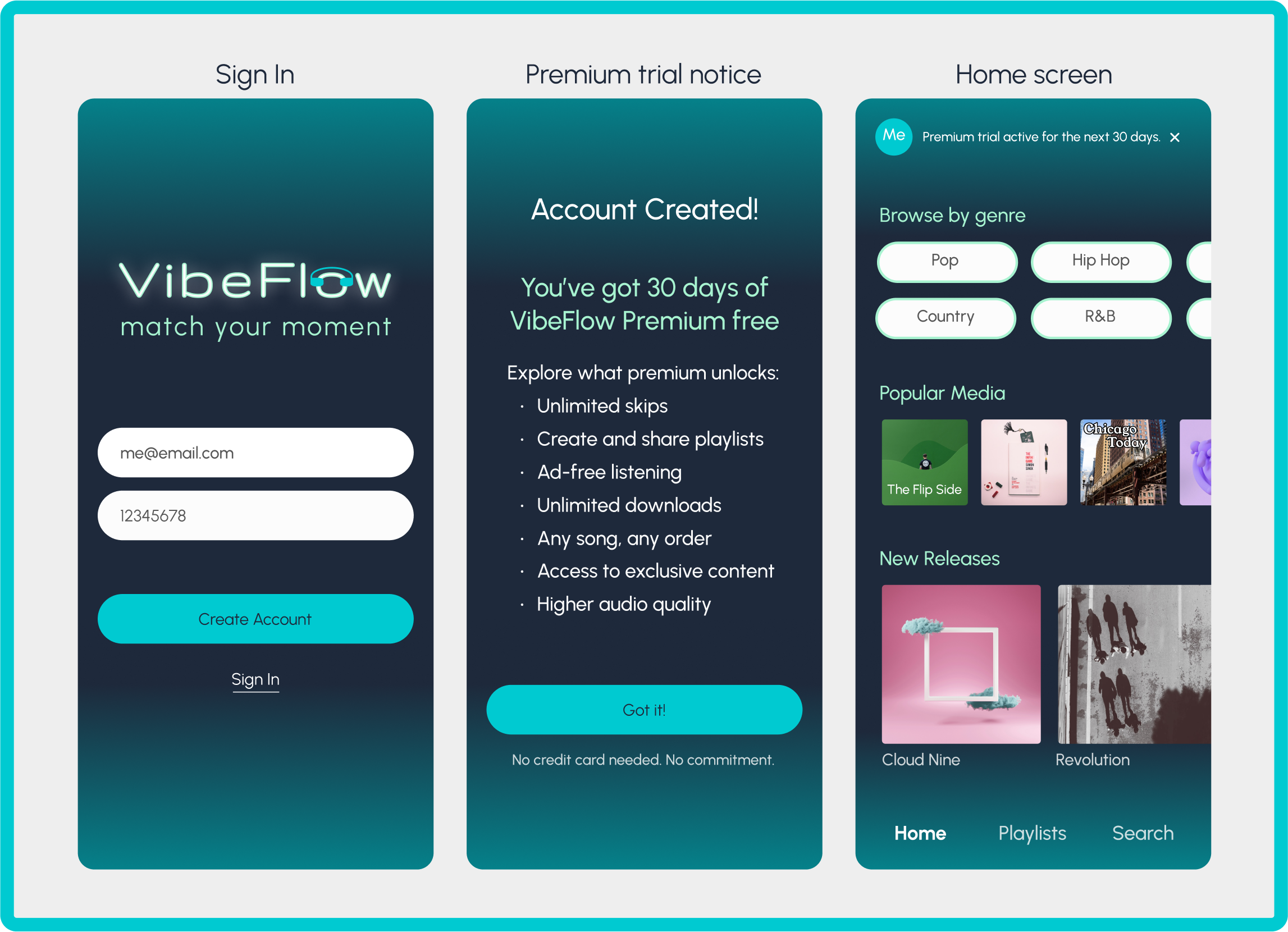
This flow welcomes new users, highlights the value of premium, and gets them exploring - all within a few taps.
Skip Limit Flow
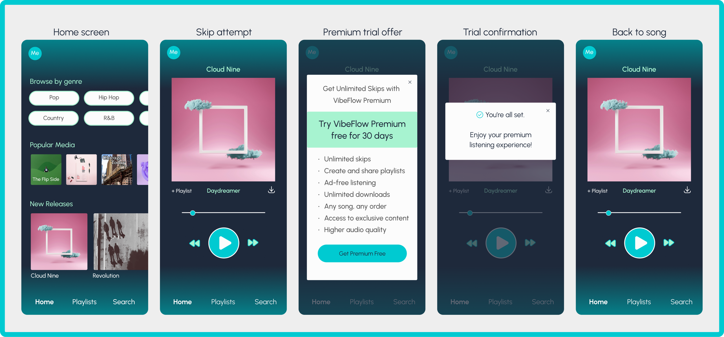
Designed to drive conversions, this upgrade prompt appears at a natural friction point, encouraging users to explore premium without breaking their rhythm.
Ad Removal Flow

An upgrade prompt appears during an ad, offering a free 30-day trial of VibeFlow Premium for an uninterrupted listening experience.
Designing VibeFlow challenged me to strike the right balance between business goals and user trust, especially when prompting free users to upgrade. I learned how small details in copy and timing can dramatically shape user perception, and how important it is to validate those decisions through testing.
If I were to continue this project, I’d focus on:
1.Exploring personalization in upgrade messaging based on user behavior or listening habits.
2. Tracking what happens after the 30-day trial ends. How many users convert, drop off, or continue using the free version.
Thanks for taking the time to check out this case study. If you're curious to hear more about my design process, want to share feedback, or just want to connect with a fellow designer, I’d love to hear from you.
I conducted a second round of usability testing to evaluate how well VibeFlow’s upgrade prompts were received by users.
Key Insights:
1. Positive feedback centered around the automatic free trial enrollment and the ad removal prompt, which users found especially compelling.
2. Emotional friction emerged around the skip limit messaging. Several participants felt the tone came off as punitive or “scolding”, which weakened trust.
3. Information gaps were noted by users who wanted more upfront clarity on skip limits and a clearer explanation of what would happen when their Premium trial ended.
No high severity issues were identified, but tone and clarity improvements were needed to enhance user trust and emotional engagement.

New User Sign-up Flow

Based on user feedback, headings were softened to reduce perceived judgment, and clarity around the trial's no-commitment policy was enhanced.
More Projects