presently: A Scheduling App for Mindful Decision-Making
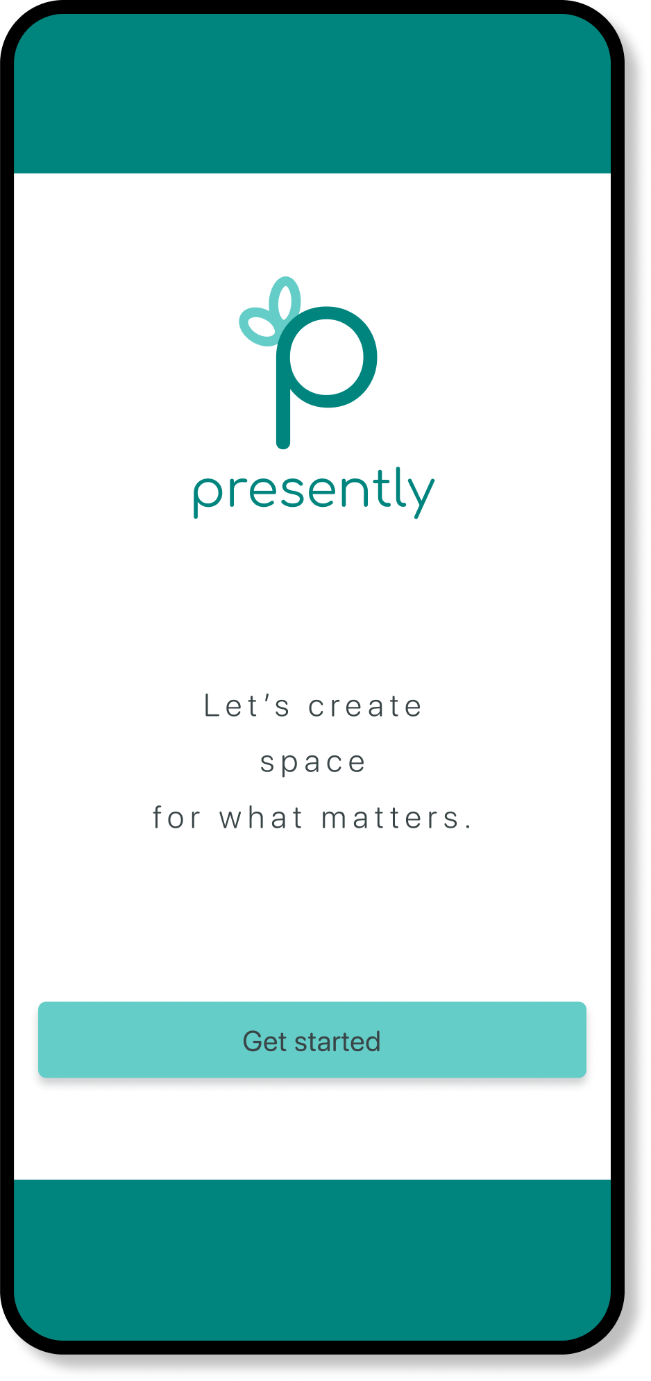
End-to-end UI/UX case study focusing on helping users protect their time and energy.
Overview
Most scheduling tools focus on the logistics - who, what, where - but skip the more important question:
Does this event deserve space on my schedule?
I set out to design presently, an app that acts like a thoughtful companion, helping users pause and reflect before saying yes. By focusing on the decision-making moment, presently encourages choices that align with personal values and protect time and energy.
Role
As the sole designer and researcher, I led the project from initial research to high-fidelity design, creating an experience that feels like a trusted friend, not just another productivity tool.
Problem Space
I began by exploring overcommitment and decision-making around time, aiming to understand why people feel overwhelmed by commitments. It became clear that scheduling tools did little to prevent overcommitment. This shifted my focus to supporting people in how they make choices when faced with competing demands.

How might we help people make choices that stay true to their values?
Research Question
I conducted qualitative interviews to understand the emotional side of decision-making and used open-ended questions to discover how users decide what to say yes to, what pressures they feel, and how they currently manage their time. Patterns quickly emerged:
Guilt
Pressure to say ‘Yes’
Struggle to balance obligations with personal well being
Even highly organized people feel trapped by full calendars because they find it difficult to say no.
User Research
Key Insight
People aren’t struggling to plan their time. They’re struggling to protect it.

Research Synthesis
To better understand patterns in my research, I created an affinity map to cluster user quotes and themes, focusing on emotions, pain points, and desires around commitments.
Mismatch between intention and reality People want to prioritize meaningful, joyful activities, but these are often the first to be postponed when life gets busy.
Taking pauses and creating boundaries is helpful Taking a moment to reflect and having clear boundaries improves decision-making.
Desire to reduce commitments Many users wanted fewer commitments but found it challenging to achieve this in practice.
Difficulty saying no Users struggled with declining requests, especially when they felt obligated or faced social pressure.
Research Insights

User Persona
Creating a persona helped transform research data into a relatable user story, highlighting emotional pain points like guilt and pressure to say yes. This guided my design decisions toward solutions that offer both emotional support and practical tools.
Designing Solutions
Guided by these insights, I designed features that help users align their actions with their intentions:
Alignment Tracker A visual snapshot showing how well their schedule reflects their priorities.
Decision Buddy A prompt for reflection that helps users evaluate new commitments and flags potential conflicts with their boundaries.
Overcommitment Alerts Notifications that warn users when their schedule is becoming too full.
Decline Guide A helpful tool for crafting clear, confident messages to turn down requests while preserving relationships.
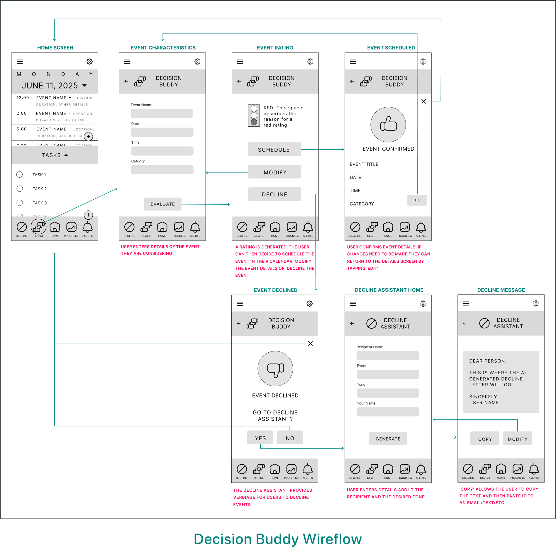
After defining presently’s core features, I mapped user flows to define how users might naturally encounter and engage with each one, like turning to Decision Buddy when considering a new commitment.
User Flows

Decision Buddy: Decision Buddy prompts users to pause before accepting a new commitment by walking them through a quick reflection based on the values, boundaries, and priorities they’ve set in Presently.
I created low-fidelity wireframes to explore how Presently could visually support the journey through layout and interaction design, allowing me to quickly test ideas around hierarchy, usability, and tone.
Wireframes
Style Guide

Logo
To reinforce presently’s supportive experience, I developed a visual identity rooted in simplicity and calm. The logo features a lowercase ‘p’ with a circular form that hints at a clock face, and a bow as a subtle reminder that mindful scheduling is a gift of time.

Color Palette
The presently color palette is intentionally analogous, creating a cohesive experience that aligns with the app’s focus of mindful scheduling. The refined palette minimizes visual distractions, maintaining a clean interface that supports presence and focus.
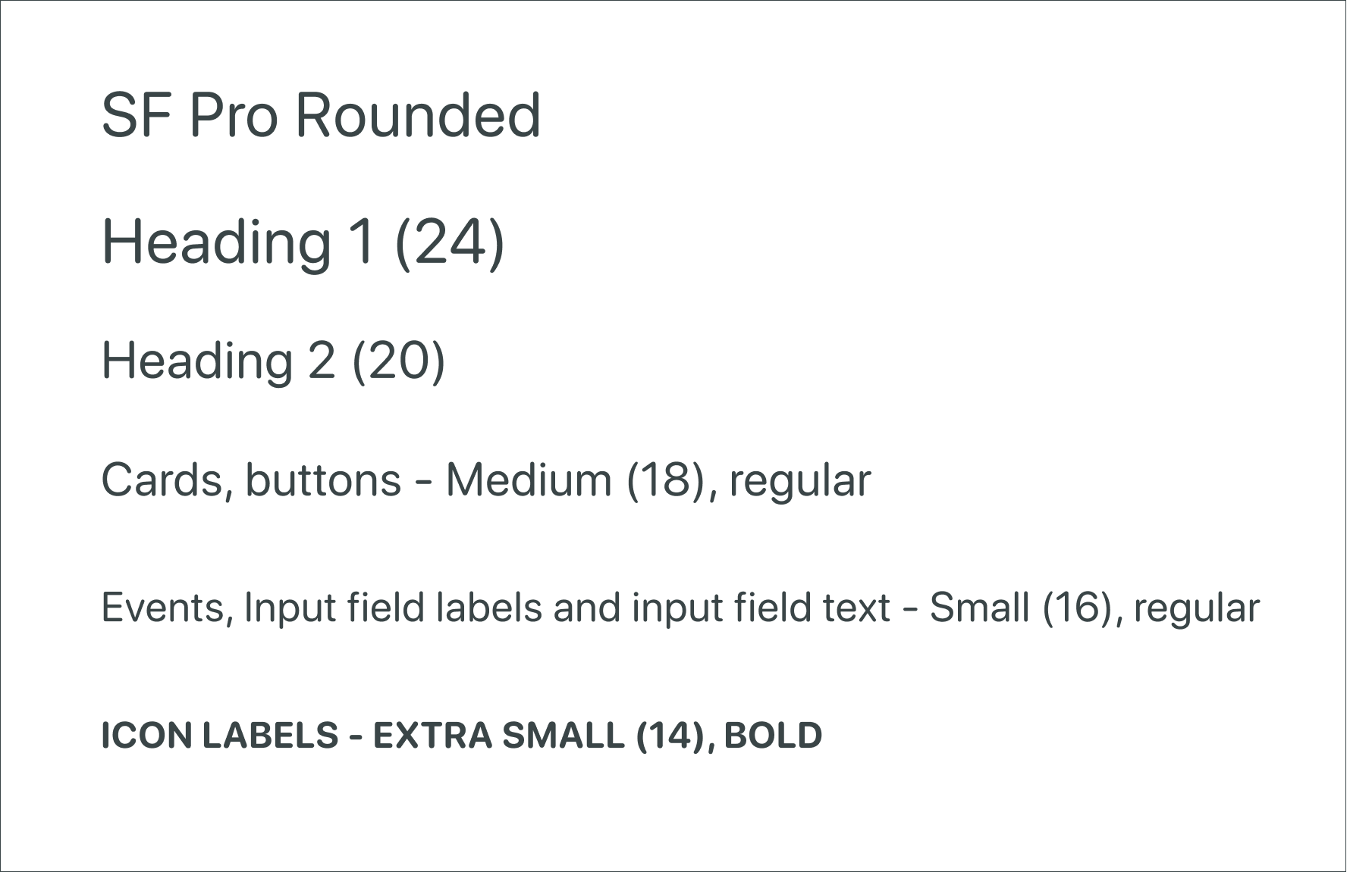
Typography
SF Pro Rounded was chosen for its clean and approachable feel. The smooth letterforms reinforce the brand’s warm and inviting tone.
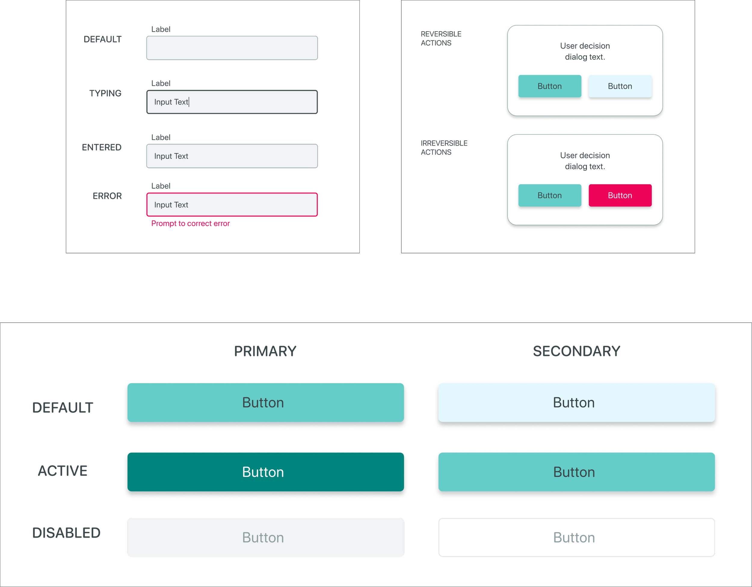
UI Elements
presently’s UI components are designed to be intuitive and minimal, ensuring a seamless user experience that aligns with the brand’s mission of mindful scheduling.

Icons
The presently icons were chosen for their minimal, line-based style and soft edges - all of which help to maintain visual harmony with the app’s clean and calming aesthetic.

High-fidelity Designs


Prototype
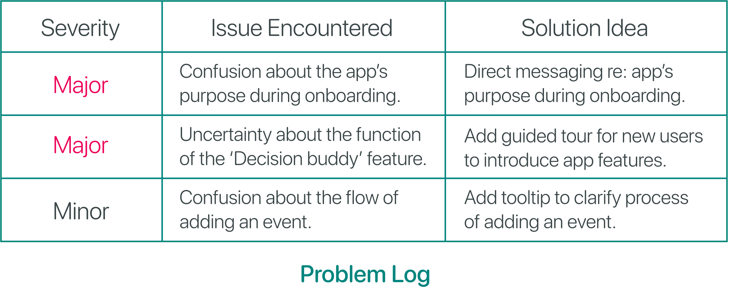
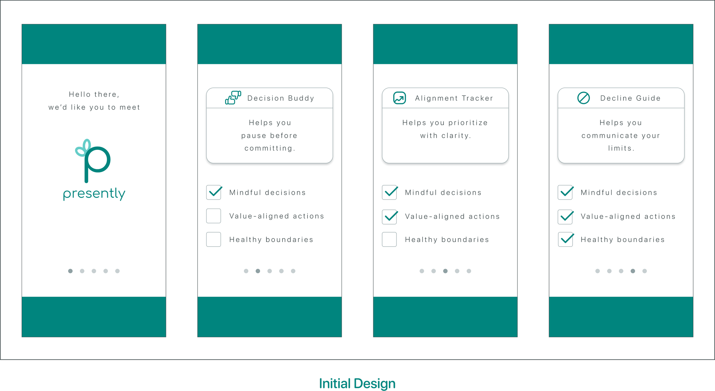
I tested presently’s prototype with five users to evaluate key tasks: creating an account, making commitment decisions, resolving scheduling conflicts, adding events, and checking availability.
Testing identified opportunities for improvement. Several users were uncertain about the app’s purpose during onboarding, and some were unsure when to utilize Decision Buddy. These insights highlighted the need to improve onboarding clarity and introduce features more effectively.
Usability Testing
Iteration
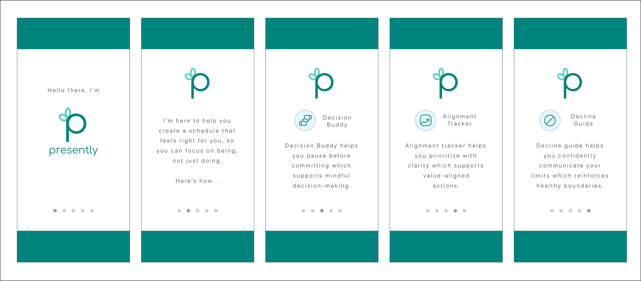
Iteration: The app’s purpose is clearly stated on the second screen and the subsequent screens explain how that purpose will be realized.
This project validated my early insight: people aren’t lacking planning tools, they’re lacking support in protecting their time from overcommitment. User feedback confirmed that presently’s prompts to pause and reflect felt helpful and unique among scheduling tools.
I gained valuable insights into designing tools that encourage thoughtful decision-making without adding friction. If I were to continue this project, I would run further usability tests, explore calendar integrations, and test long-term engagement with features like the Alignment Tracker.
Outcome & Lessons
Connect
Thanks for taking the time to check out this case study. If you're curious to hear more about my design process, want to share feedback, or just want to connect with a fellow designer, I’d love to hear from you.


